

Warm Heart Pediatrics
Brand Identity
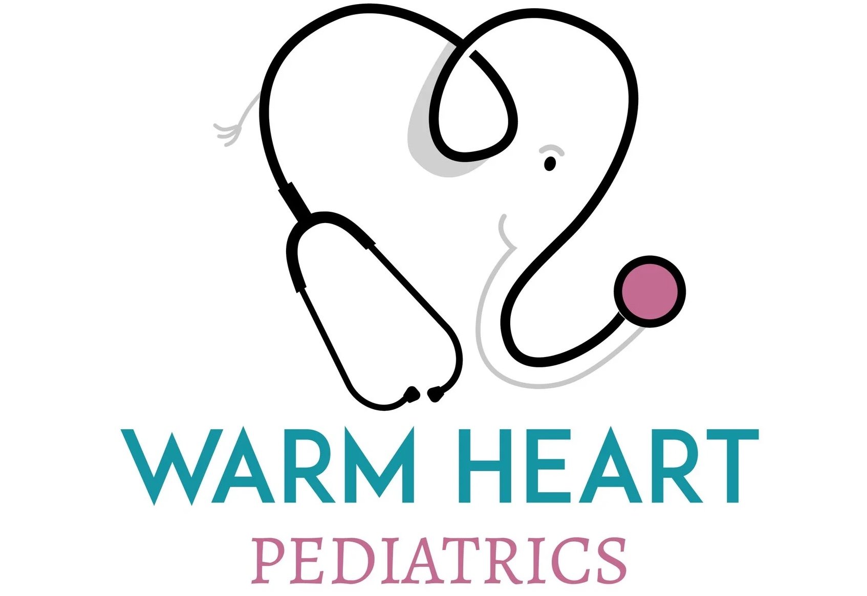
A brand built to make parents and children feel cared for before the first appointment
Client: Warm Heart Pediatrics
Industry: Pediatric healthcare
Services: Brand identity, logo design, visual direction
Recognition: First Place, Jersey Awards; Communicator Award; Silver Davey Award; American Graphic Design Award; featured in GDUSA
The challenge
Opening a pediatric practice means earning trust before a family has ever met the doctor. When Dr. Krupa Playforth launched Warm Heart Pediatrics, she had a clear vision for the kind of care she wanted to provide: medically informed, deeply compassionate, and welcoming to both children and their parents. But at the outset, the practice had very few enrolled families and no visual identity to help communicate that promise.
The challenge was not simply to design a pediatric logo. It was to create a brand that could make an unfamiliar practice feel credible, warm, and memorable at first glance.
The insight
Parents do not choose a pediatrician on credentials alone. They are looking for medical expertise, certainly, but also reassurance. They want to feel that their questions will be heard, their child will be seen as an individual, and their family will be treated with care.
That combination is central to Dr. Playforth’s work. She is a board-certified pediatrician and mother of three whose public education platform, The Pediatrician Mom, helps parents navigate childhood health and parenting with clear, evidence-based, compassionate guidance.
The Warm Heart Pediatrics identity needed to capture that same balance: professional enough to inspire confidence, but human enough to feel immediately comforting.
The idea
The final logo brings together three meaningful elements: an elephant, a heart, and a stethoscope. The elephant was inspired by Dr. Playforth’s childhood in Africa and gives the identity a personal, distinctive foundation. The heart represents compassion and the emotional reassurance parents seek from a pediatric practice. The stethoscope grounds the mark in medicine, creating an immediate visual connection to care and expertise.
Together, those elements create more than a symbol. They tell a story about the practice: expert care delivered with warmth. The identity was designed to feel friendly without becoming childish, polished without becoming clinical, and memorable without relying on the familiar visual clichés of pediatric healthcare.


Recognition
The work has been recognized by leading creative organizations, including:
First Place at the Jersey Awards
A Communicator Award
A Silver Davey Award
An American Graphic Design Award
A feature in GDUSA’s 60th annual publication
Recognition is gratifying, but it is not the reason the work succeeded. The real success is that the brand communicates something parents can feel: this is a place where their child will be cared for.
A brand with a real point of view
Warm Heart Pediatrics proves that healthcare branding does not need to feel cold, generic, or interchangeable.
By grounding the identity in Dr. Playforth’s personal story and professional philosophy, Brand Force 5 created a mark that is focused, ownable, relevant, and built to grow with the practice.
Need a brand that helps people trust you before they ever pick up the phone?
Start a conversation with Brand Force 5.

The result
The new identity gave Warm Heart Pediatrics a recognizable and emotionally resonant way to introduce itself to families. What began with only a small number of enrolled patients grew into a practice serving more than 35 families—enough demand that the practice needed a waiting list for new-patient signups.
The logo also gave the practice a cohesive visual foundation across its real-world touchpoints, from apparel and communications to the everyday materials that shape a parent’s first impression.
Health and Wellness branding has become one of our specialties. See some of our brand projects specific to healthcare