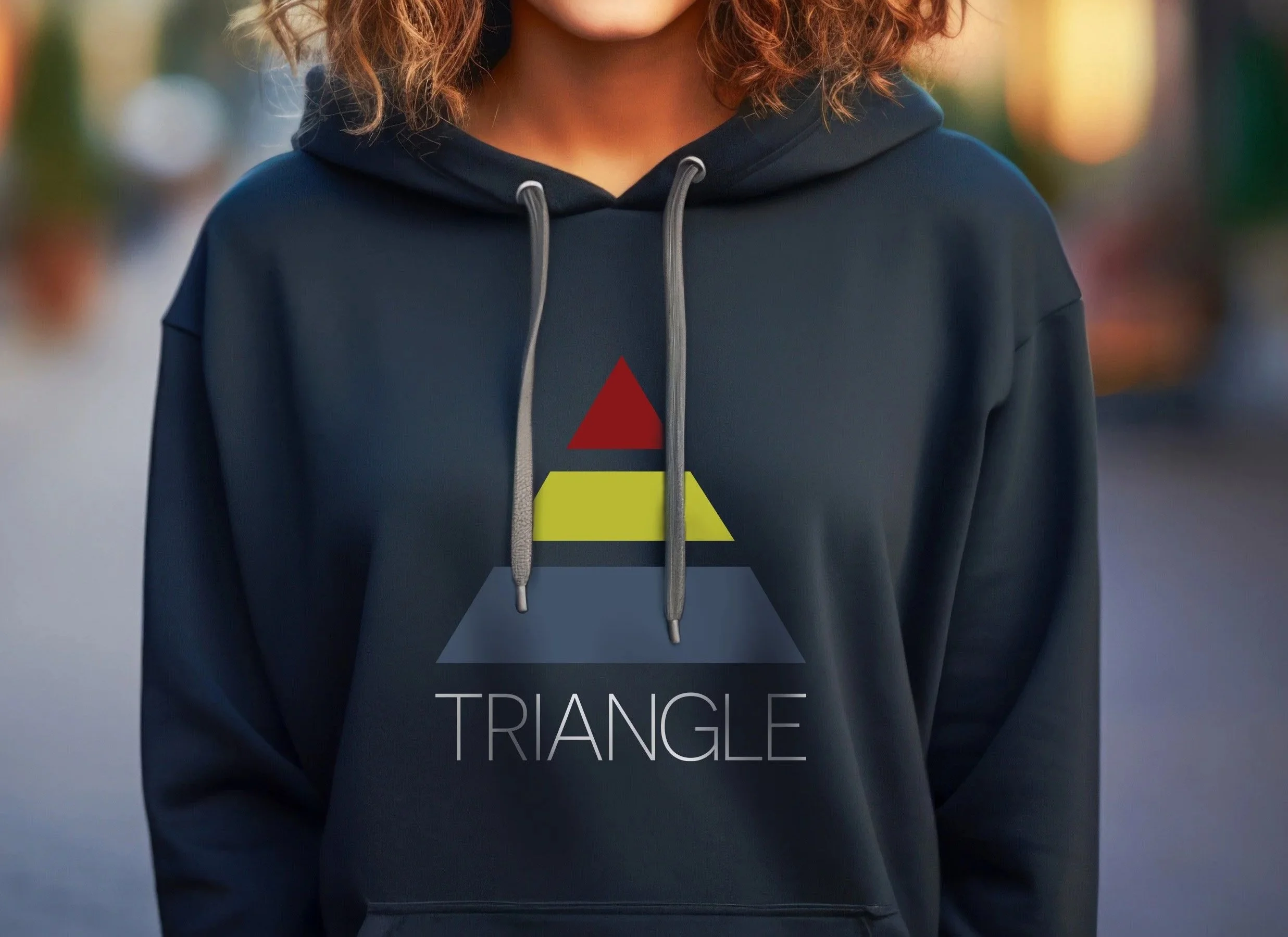
Triangle Fitness Logo Design
Triangle Fitness is dedicated to a holistic approach to training, focusing on the integration of mind, body, and soul. We designed both their logo and website to embody this mission. The logo’s elegant simplicity features a stylized 'A' forming a three-tiered triangle in distinct colors, each level representing an essential aspect of total well-being. The website, Triangle Fitness, further reflects this vision with a sleek design and thoughtfully incorporated video, creating an engaging and immersive user experience that invites visitors to book a session and explore their path to balance and strength.
Building a Complete Fitness Brand
The Triangle Fitness identity was designed as more than a logo. Brand Force 5 developed a complete brand identity system, including the logo, typography, color palette and supporting visual elements. The triangular “A” at the center of the identity represents the three interconnected parts of Triangle Fitness’ coaching philosophy—physical, mental and spiritual wellness—giving the brand a visual idea that is directly connected to the business itself.
That identity was then carried across the entire fitness brand experience, from website design and digital communications to shirts, tote bags and other branded materials. Consistent typography, color and graphic elements allow Triangle Fitness to remain recognizable whether someone encounters the brand online, at a training session or through promotional merchandise.
The website extends that identity into a functional business tool, integrating scheduling and client-facing features into the branded experience. The result is a cohesive fitness and wellness brand where logo design, graphic design, web design and real-world applications all work together—creating a consistent identity that supports both the philosophy behind Triangle Fitness and the way clients interact with the business.