

Legal Ops Fox
Brand Design
The Assignment:
Legal Ops Fox needed a logo that would stand apart in a category often defined by generic, overly corporate visuals. The challenge was to create an identity that felt intelligent and strategic without becoming cold or impersonal. The logo had to reflect the complexity of legal operations while remaining clear, approachable, and memorable. At the same time, the brand needed to feel personal to its founder, Adrienne Fox, and flexible enough to work across digital platforms, presentations, and thought leadership content.
Our Approach:
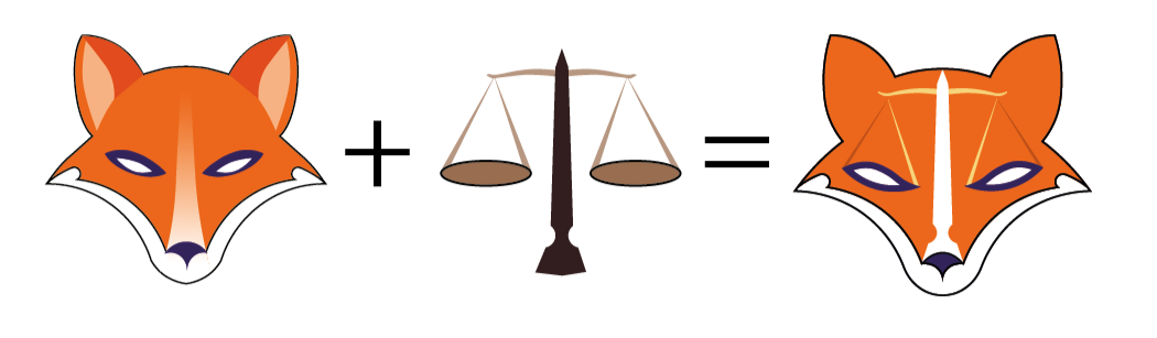
We began by anchoring the identity in the founder’s name, using the fox as both a literal and symbolic foundation. Rather than relying on clichés, we explored how the fox could embody intelligence, precision, and agility through simplified, intentional form. The design integrates the scales of justice into the fox’s facial structure, creating a balanced connection to the legal field without sacrificing clarity. The result is a mark that feels both strategic and human. The result is distinctive, adaptable, and built to carry the brand across a wide range of applications.
The Solution:
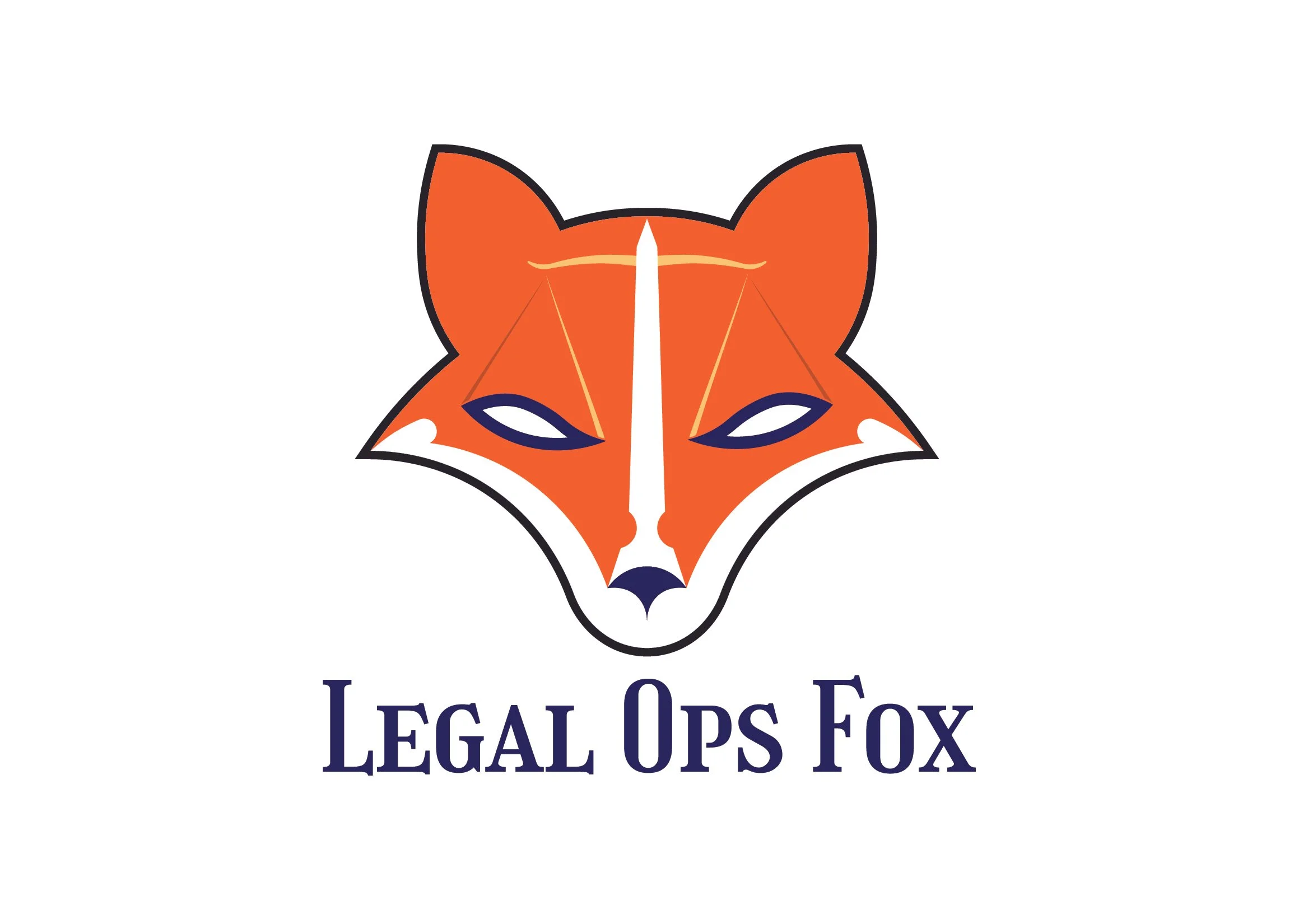
The final logo transforms the founder’s name into a distinctive and ownable mark. A refined fox icon expresses intelligence, strategy, precision, and agility through a clean, thoughtful design, with the scales of justice integrated into the facial structure to create a clear connection to the legal world. Paired with modern, confident typography, the identity feels sharp, memorable, and stands apart from typical legal branding.
Our Thanks:
We hope this branding case study provided insight into how Brand Force 5 approaches design challenges and transforms them into opportunities. If you’re ready to elevate your brand or discuss how we can support your next project, we’d love to connect. Reach out to our Chief Creative Officer, here and let’s create something extraordinary together!