

ELEVATION EMS
Logo Design
The Assignment:
As a startup preparing to launch, Elevation EMS needed a brand identity that would establish instant credibility and reflect the professionalism, trust, and confidence at the heart of its mission. They partnered with Brand Force 5 to create a logo that would make a powerful first impression from day one.
Our Approach:
Every great brand starts with a strong idea. Our goal was to create an identity that was memorable and meaningful. The result is a smart, clean, versatile logo that works just as well on their business cards as it does on their shirts, vehicles, and training materials, giving Elevation EMS a brand that communicates confidence wherever it’s seen.
The Solution
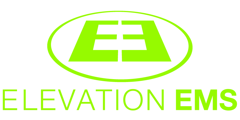
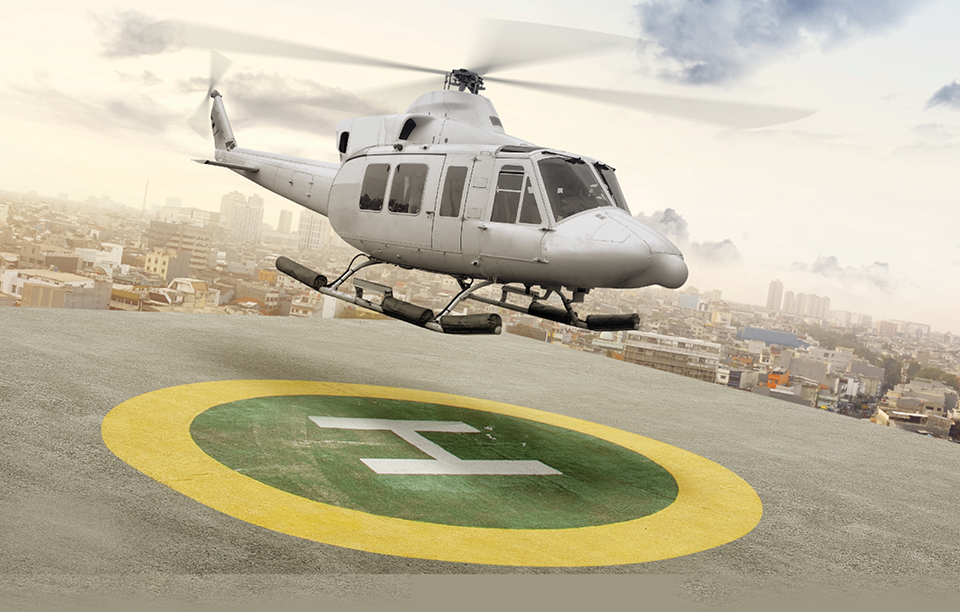
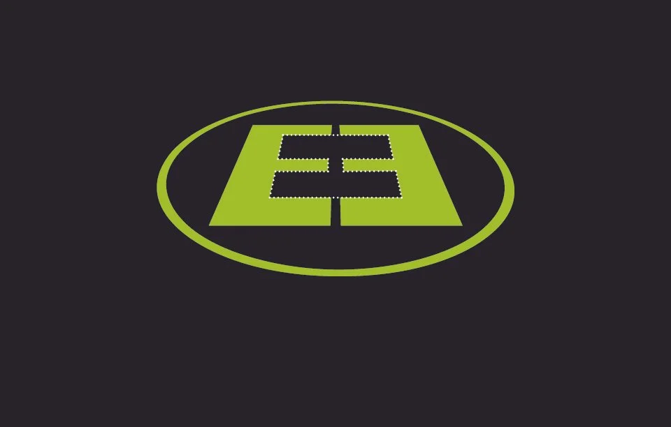
The identity began with two mirrored capital E’s, revealing an H in the negative space. Framed inside an oval, that H creates the international symbol for a helipad, a direct reference to founder Rick Nye’s career as a flight medic and the role helicopters play in emergency medicine.
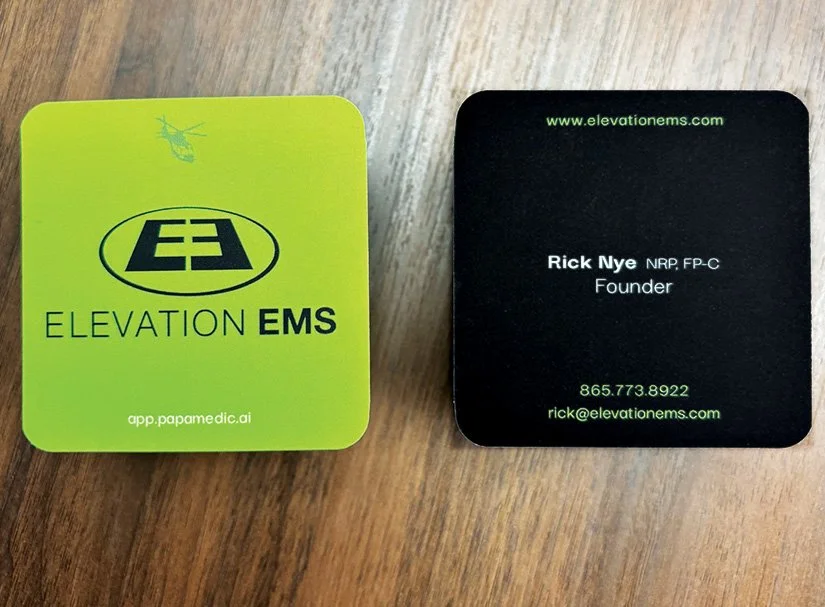
The idea doesn’t stop with the logo. A distant helicopter silhouette appears throughout the branding, from the business cards to apparel, reinforcing the story and creating a visual thread that ties the entire identity together.
Every EMT and paramedic, the people Elevation EMS was built for, will recognize the helipad hidden within the mark. To them, it represents urgency, hope, and second chances. That connection gives the identity meaning that goes beyond what the average person may see at first glance.
Video showing how the logo is both mirrored letter Es as well as the icon for a helipad
We’re proud and honored that this project has already won a Graphic Design USA Health And Wellness Award and is featured in the 2026 Award Gallery and publication.
Health and Wellness branding has become one of our specialties. See some of our brand projects specific to healthcare
Our Thanks:
We’re proud of this one. Rick trusted us with something that matters to him, a brand that represents real work, real stakes, and real people. That trust isn’t something we take lightly. If you’d like to learn more about how we approach logo design and brand identity, we’d love to talk. Reach out to our Chief Creative Officer and let’s start a conversation.