

ELEVATION EMS
BRANDING AND IDENTITY DESIGN
[ IMAGE PLACEHOLDER: Logo mark breakdown graphic - upload annotated logo file here ]
The Elevation EMS mark is built from two mirrored capital letter E’s, facing each other in perfect symmetry, enclosed within an oval. Where the two E’s meet, the negative space between them forms a horizontal H - the unmistakable symbol of a helipad. Combined with the oval frame, the mark becomes a complete helipad symbol: a form recognized the world over as a landing zone for life-saving aircraft.
For founder Richard Nye - a paramedic and flight medic with over a decade of field experience - this is more than a clever design. It is a calling made visible. The helipad is where speed, skill, and life converge. It is the place where providers must be at their absolute best. Elevation EMS exists to make sure they are.
Elevation EMS was founded on a conviction that has been earned in the field: that excellence is not a credential you display - it is a standard you practice every single day.
Richard Nye has worked EMS in nearly every environment it exists - IFT transport, urban and rural 911, chase-car paramedic, critical care, and as a flight medic in the air. He has seen what happens when providers are underprepared, and he built Elevation EMS to change that. Whether a student pursuing initial licensure, a provider seeking continuing education, or an agency looking for field-ready simulation training, Elevation EMS meets providers where they are and raises the bar.
The identity we created for Elevation EMS reflects that mission - bold, precise, and built with purpose. A brand that looks as serious as the work it represents.
[ IMAGE PLACEHOLDER: Full primary logo lockup - upload Elevation EMS logo on white background ]
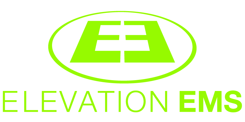
The best logos tell a story without saying a word. This one just happens to do it with a helipad.
The mark was designed to instantly evoke the world of emergency medicine and flight rescue. Framed within an oval, it captures the familiar look of a landing pad from above—a simple visual cue that’s immediately at home in the EMS world. It’s a subtle nod to the medics, paramedics, and flight crews who spend their careers answering calls that can’t wait.
Like the people it represents, the logo is straightforward, dependable, and purposeful. There’s no unnecessary decoration or visual noise—just a clean, confident mark that’s easy to recognize whether it’s embroidered on a uniform, printed on a business card, or racing down the highway on the side of an ambulance.
Sometimes the simplest ideas have the greatest lift.
[ IMAGE PLACEHOLDER: Logo variations strip - upload logo versions on different color backgrounds here ]
The Elevation EMS mark was designed to work across every environment a first responder operates in — from clinical white to tactical dark. The identity holds its own on a bright uniform patch, a dark vehicle door, a digital screen, or a printed card.
Each variation of the mark — on white, on dark, reversed, and in single color — is intentional. A brand that goes to work in the field needs to show up clearly every time.
Our Thanks:
We hope this branding case study provided insight into how Brand Force 5 approaches design challenges and transforms them into opportunities. If you’re ready to elevate your brand or discuss how we can support your next project, we’d love to connect. Reach out to our Chief Creative Officer and let’s create something extraordinary together!