Warm Heart Pediatrics

Classic but whimsical logo for a Virginia based pediatrician who grew up in Africa.

What do you get when you combine an elephant, a stethoscope, and a heart.
An award winning logo! Warm Heart Pediatrics was founded by Dr. Krupa Playforth, a physician who grew up in Africa. What better way to highlight and pay homage to her upbringing than by including an elephant in her logo.

Silver Medal Winner!
We’re honored and thrilled that this logo was recognized as one of the best-of-the-best by the 2023 Davey Awards.

Out of over 8,000 entries it’s also featured in the 2023 GDUSA 60th edition publication.
Hiker’s Weather App DEsign and Branding

Brand and App Design
Hiker’s Weather is an app that uses an algorithm that tells users the best time to go hiking. Brand Force 5 helped brand and design the app, creating the logo, the illustrations and improving the overall user experience.

The Chosen Logo
Combining a hiker and a weathervane is the perfect icon to communicate what the App is for.
Some of the UX design and Illustrations for the App:

Custom Illustrations
Brand Force 5 illustrated simple, fun, and relatable characters to help bring the whole User Experience to life for the Hiker’s Weather App.
Triangle Fitness
Custom Triangle branding and web design
Triangle is a fitness company founded by David Joniak, world class athlete and coach. We created a custom branding package, including a website that users can schedule training sessions, pay for them and get a custom video link e-mailed to them all in one place. Visit Triangle Fitness to check it out for yourself.
Mighty Moose Transporters
All American
Our client, Mighty Moose Transporters, wanted a patriotic, all American logo and color palette but we went a step further and created an ownable color scheme to highlight their brand and have them standout.
KR Mechanical Branding Assignment

When KR Mechanical needed a logo they called BrandForce.
Even though Kerry Mowlam and Raymond Chin were starting a brand new company, they had over 45 years of combined experience in the field. They needed a strong and simple logo but one that was representative of a traditional, American company. We stepped in and designed something they could use not only on business cards, and their office door, but on their employees shirts and on the side of their trucks. The K and R are obviously their initials but because they both have such great reputations in the field, the K and R is now known to stand for Knowledge and Reliability. To learn more check out www.krmechanical.com
The KR Mechanical website is both responsive and elegantly designed. A sample of it is shown here on a Mobile phone.
Boomerang Water

Combining Passions
With a love for great design and a love for rowing we’ve had the honor of bringing them together on many of these projects. Getting to design rowing club logos, seasonal challenges, t-shirts, and stickers has been a lot of fun and very rewarding.
the 444 mile challenge

More than a logo
The department of Veteran Affairs is home to the United States' largest integrated health care system. The 444 Mile Challenge, was born out of the need to inspire its staff and members to get and stay in shape. Brand Force 5 named and branded this virtual challenge on all of their materials and the logo itself became the finisher’s medal that participants received once they completed the challenge.

The actual finisher’s medal that participants received once they completed the challenge.
Strengthlete

A strong logo
A nutrition company that focuses on strength athletes needs a strong and memorable name and a logo to go with it. BrandForce was there to help our client rebrand a tired, old nutrition company into Strengthlete a name that became a staple around CrossFit and Strongman gyms. We launched a series of products to the fitness community, including protein powders and pre-packaged pre-workout supplements. We were literally there from the beginning with Strengthlete, not just helping name the company but each product as well. We built their brand from inception to execution. Starting with designing a FOCUSED logo, and from there went on to design stationary, packaging, all of their print and digital advertising, even t-shirts and shaker cups.

GC Home Inspection Services

GC Home Inspection Services
As a first time business owner Giancarlo Sette was looking for help with not only logo design but the naming and branding of his his business. Our client wanted a traditional logo and card to represent him amongst real estate agents and new home buyers. We set out to create a logo that focused on what the company does, but do it in a bright and memorable way, symbolism, iconography and funky design sometimes need to take a back seat to the main, communication. We designed business cards, social media pages and posts, and designed his dream vintage Chevy pickup truck!
City Coach

Rebranded
Another fun yet challenging project, Jonathan Cane had an established business, City Coach. Jonathan is one of NYC’s most trusted and valued multi-sport coaches. The problem was that everyone referred to him and his business as “Coach Cane,” often forgetting City Coach. We created branding that tied in with the equity he’s built with his City Coach brand and allowed him to evolve in a way that was memorable and dynamic. The end result is a logo that is a great example of our 5 principles, F.O.R.C.E. The new logo Focuses on his brand name and what he does. In the coaching space none of his competition are using a skyline and running shoe so the logo is Ownable. Even though he does a lot of online coaching around the country, everyone knows he’s the guy from NYC, so the skyline combined with the running shoe are Relevant. This updated and dynamic logo is Continuous in that it has a timeless look to it. The logo is also continuous in that it can be able used on everything from jerseys to business cards and marketing tactics. Last but not least the logo is Evocative, it feels like it’s moving, the skyline rising up out of the shoe pulls you upward and has an energizing feeling. Let’s go for a run!
Robertet

Robertet Core Competencies
Robertet is an international fragrance and flavor company that is represented in over 50 countries around the world. They wanted “posters” to hang in their facilities but weren’t sure of exactly what they needed. Robertet has five core competencies that distinguish them and their employees from the competition. We helped them focus on using the five core competencies, one on each design, and recommended wrapped canvases for each of their facilities. These became an internal reminder, to employees, as to what sets them apart and what they should aspire to every day. Using beautiful photography, that Robertet provided, we ended up with five beautifully wrapped canvases that are now referred to as pieces of art on the walls around their offices. Click here to find out more about Robertet.

“We had an idea of what we wanted but without a lot of help from Brand Force 5, strategizing a direction, these would’ve never turned out as amazing as they did.”
Let’s Get it on promotions

Boxing promotion with a meaningful heritage
Let’s Get It On Promotions founders Terry and Tommy Lane came to BrandForce 5 with the goal of branding their company with more than a logo. The sons of world renowned boxer, boxing referee, judge and TV personality Mills Lane, they had a deep connection to the boxing community that went back for over three decades. We created a logo that has a historic quality honoring both their father, and all of the pugilists of the past. The die-cut business cards are printed on a historic textured paper and designed to simulate the boxing tickets of old. Although the stationary was given an aged treatment, the logo works beautifully on modern posters, promotional materials and of course hats and shirts!
The entire Let’s Get It On Promotions stationary package.

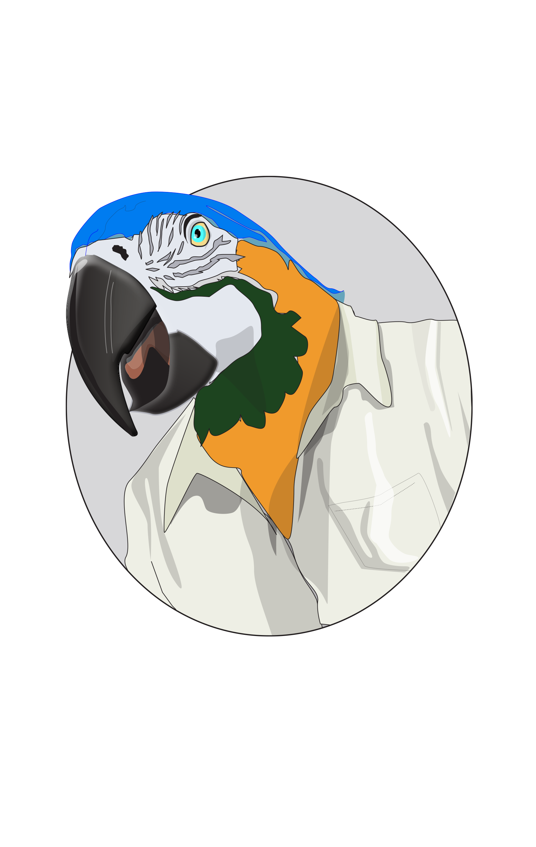
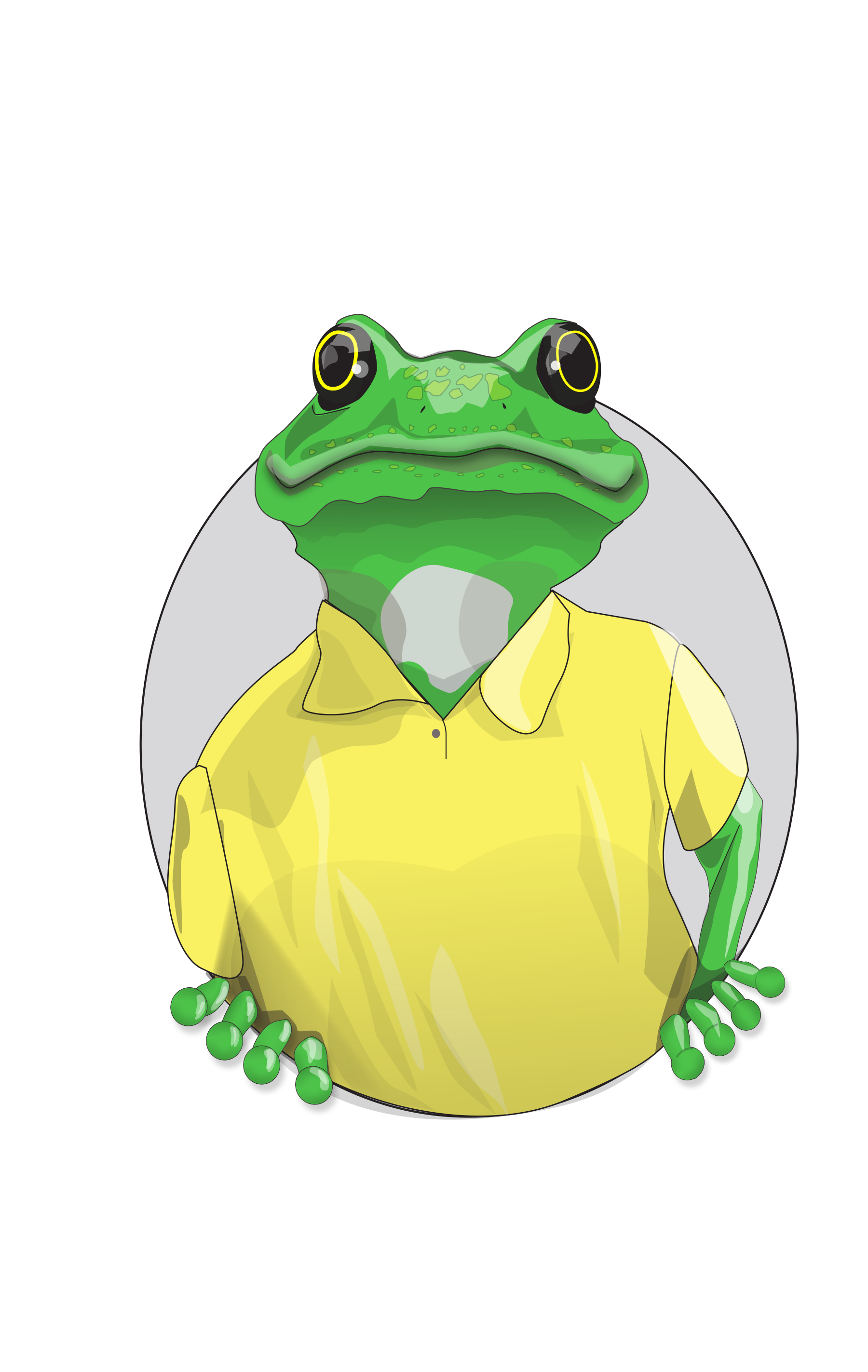
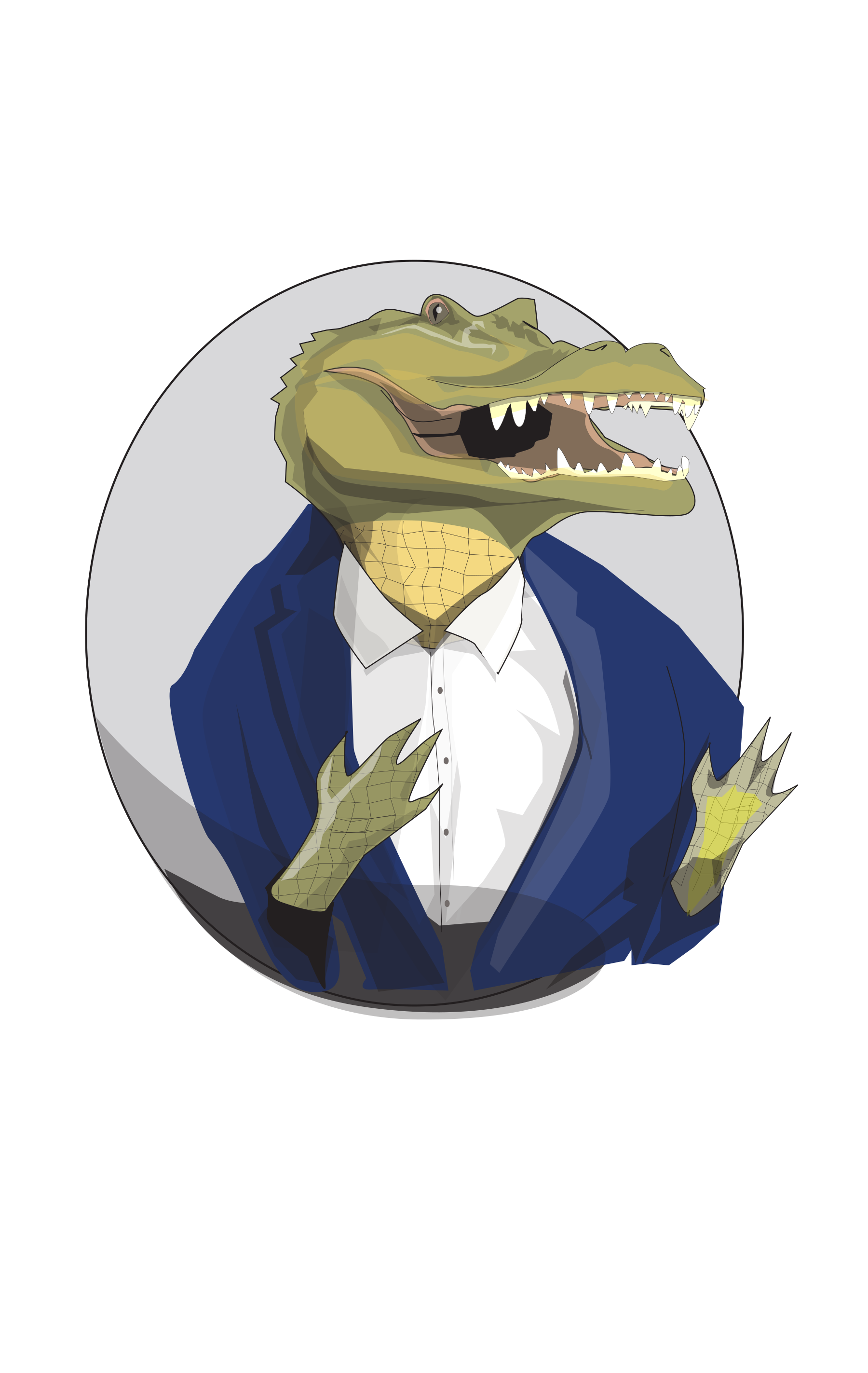
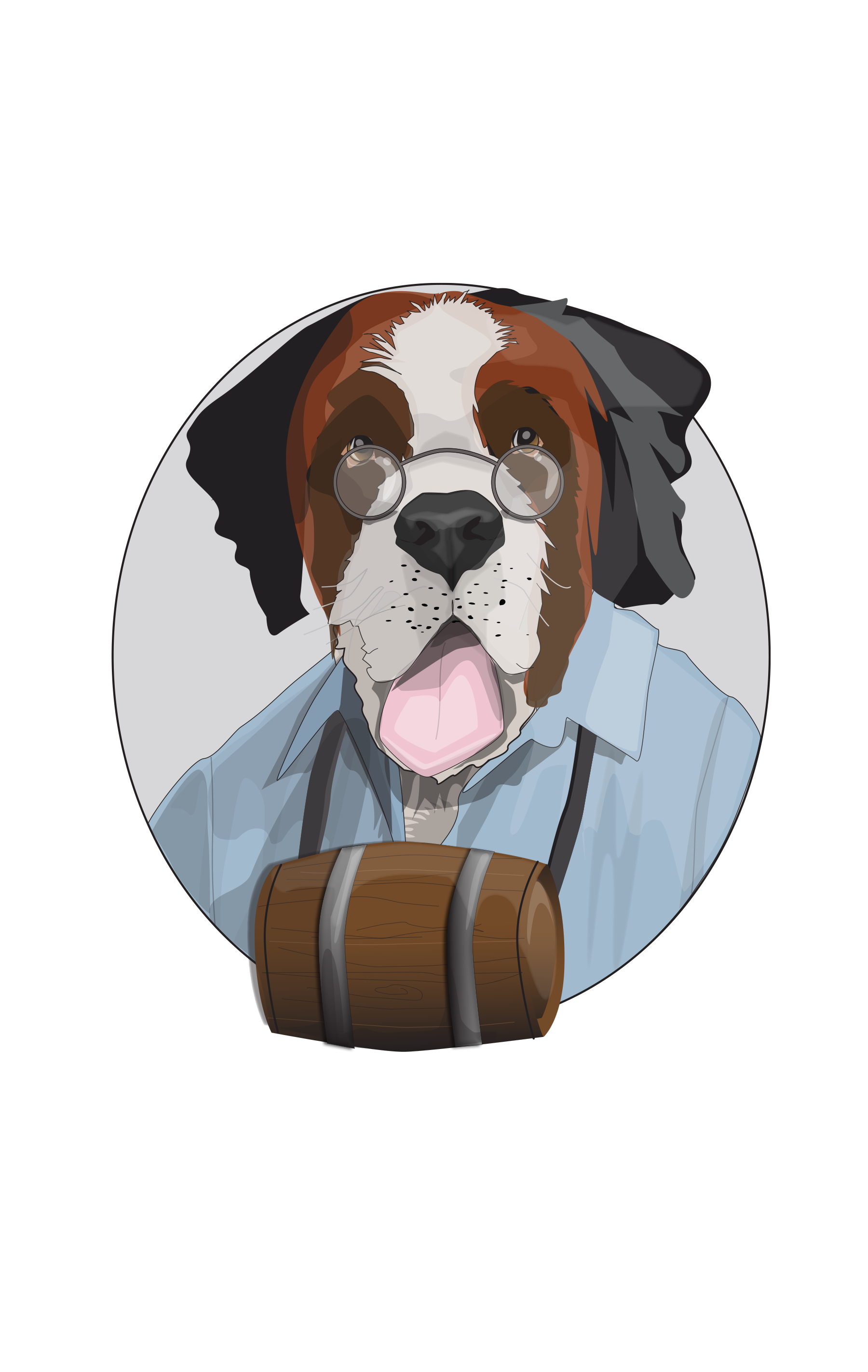
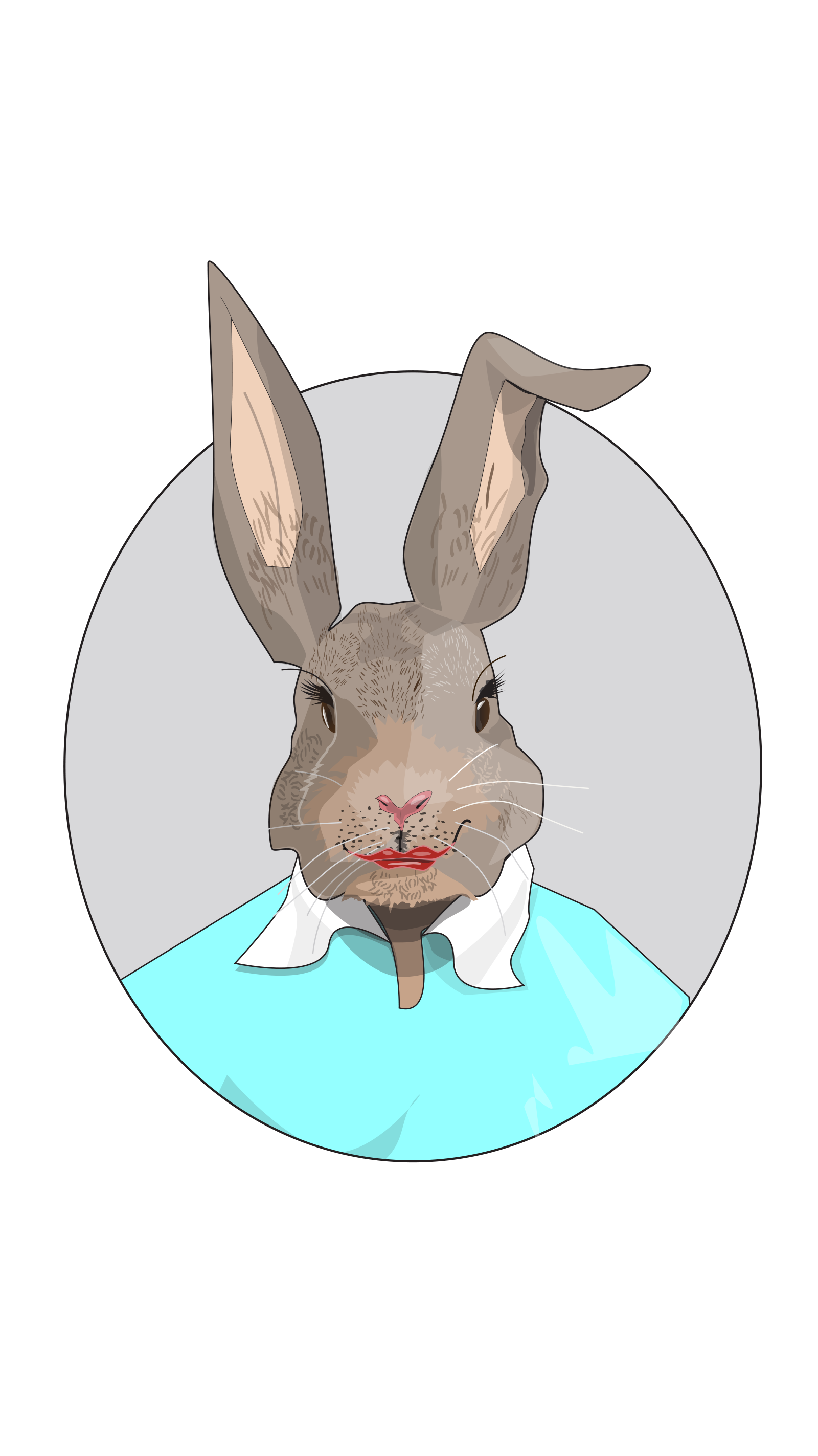
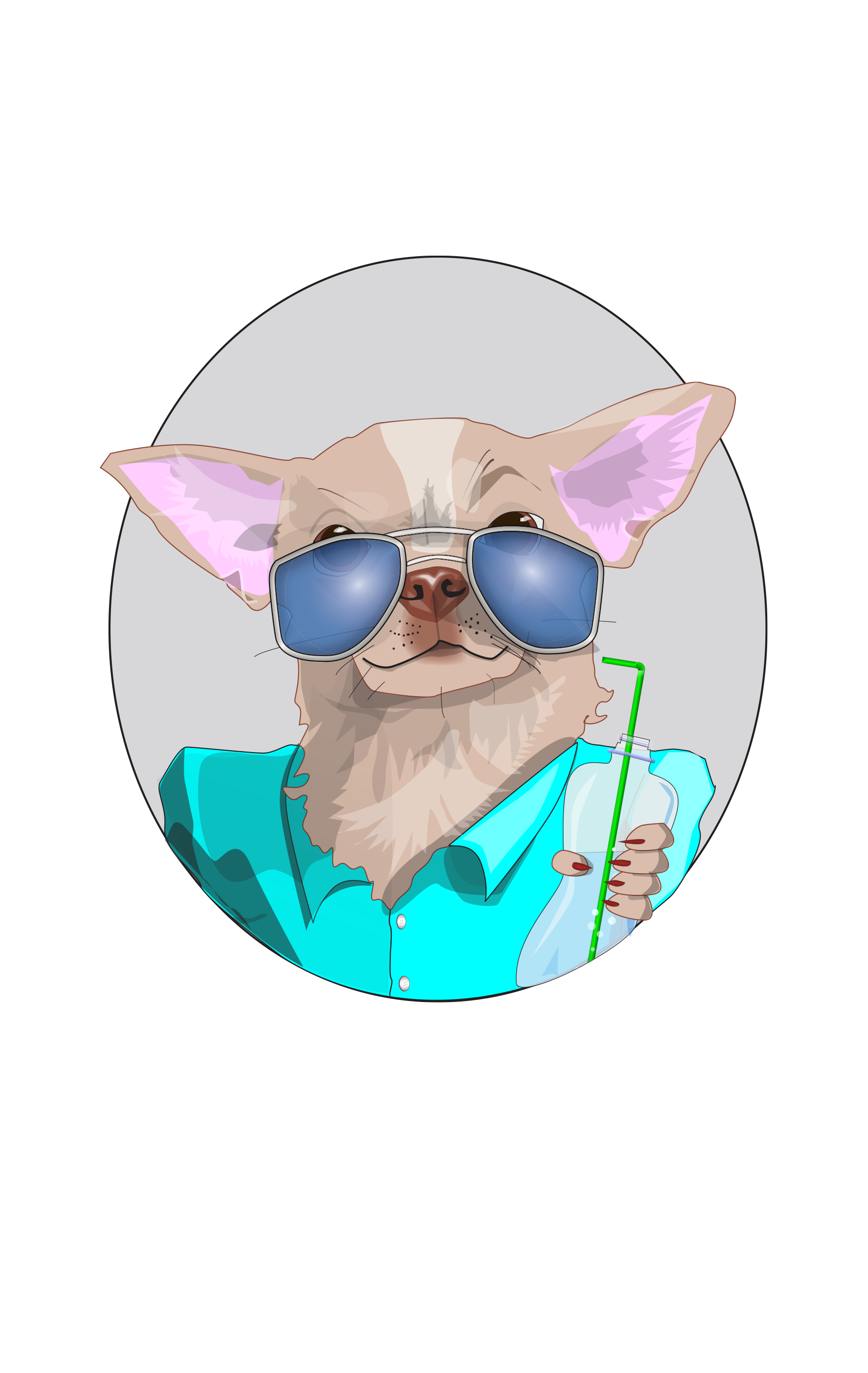
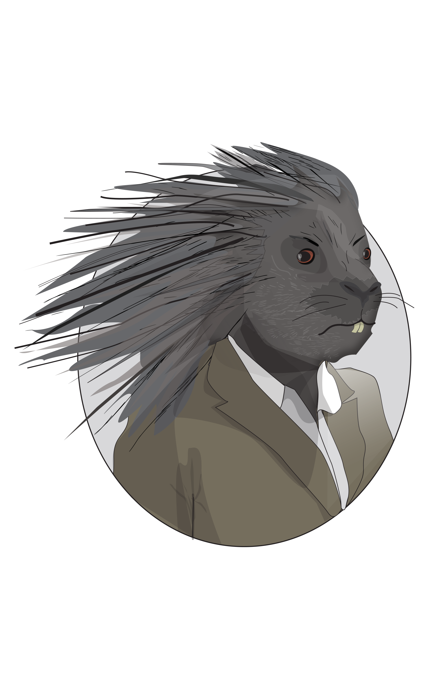
Some of the illustration work we’ve done over the years, feel free to click on any of the images for a larger look.


An illustrated B2B campaign, for ITK, these fun animal characters represent some positive and negative stereotypes you may have come across in your business dealings.