

Rate Mini-Brochure
Assignment: Create a pocket-sized brochure introducing Peter D’Angelo as more than just a lender, highlighting his expertise, credibility, and personal approach. It should be professional yet approachable, easy to digest, and visually engaging.
Our Solution: Designed for impact, this Rate brochure reinforces trust, sparks connections, and ensures potential clients walk away with more than just information but something valuable.

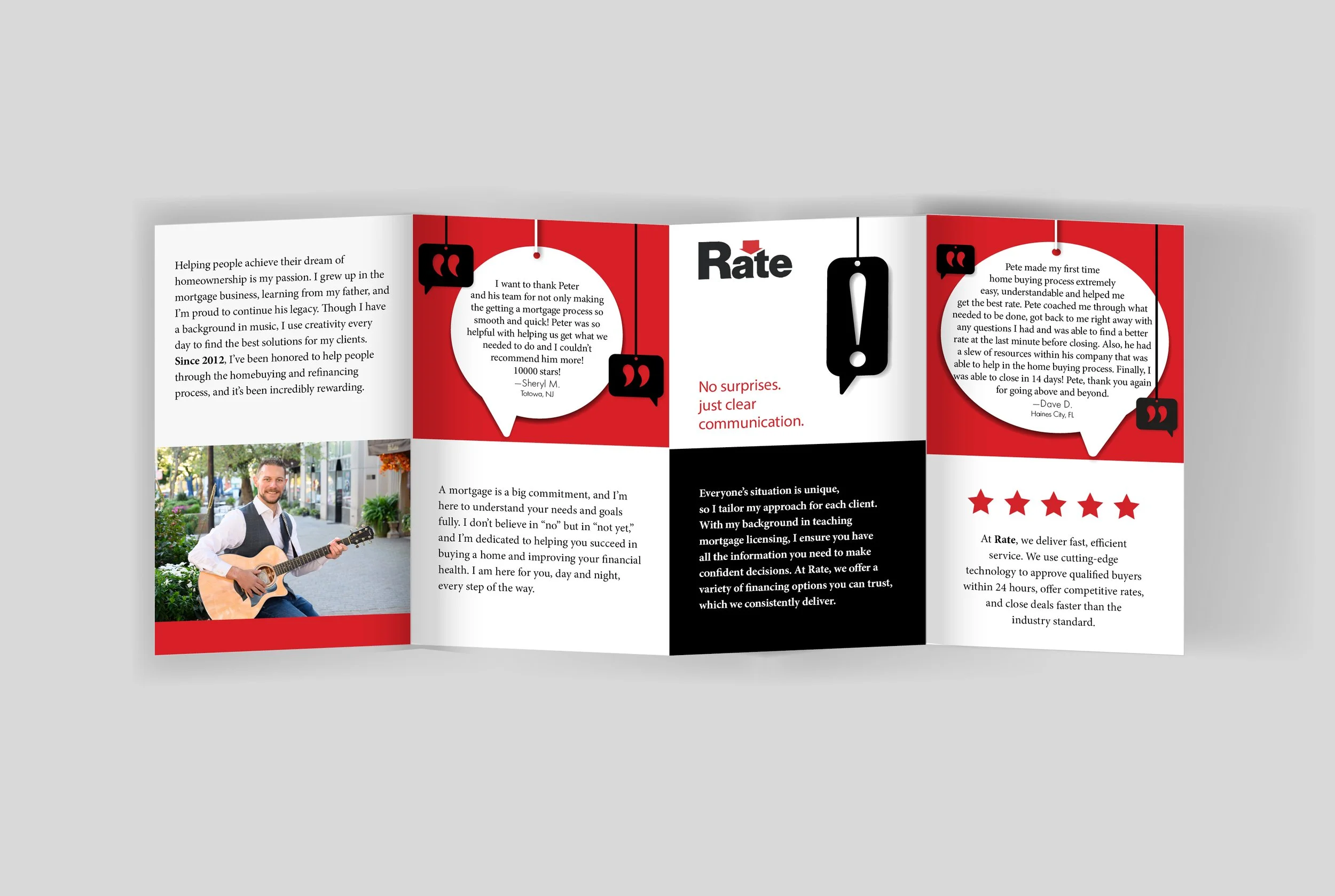
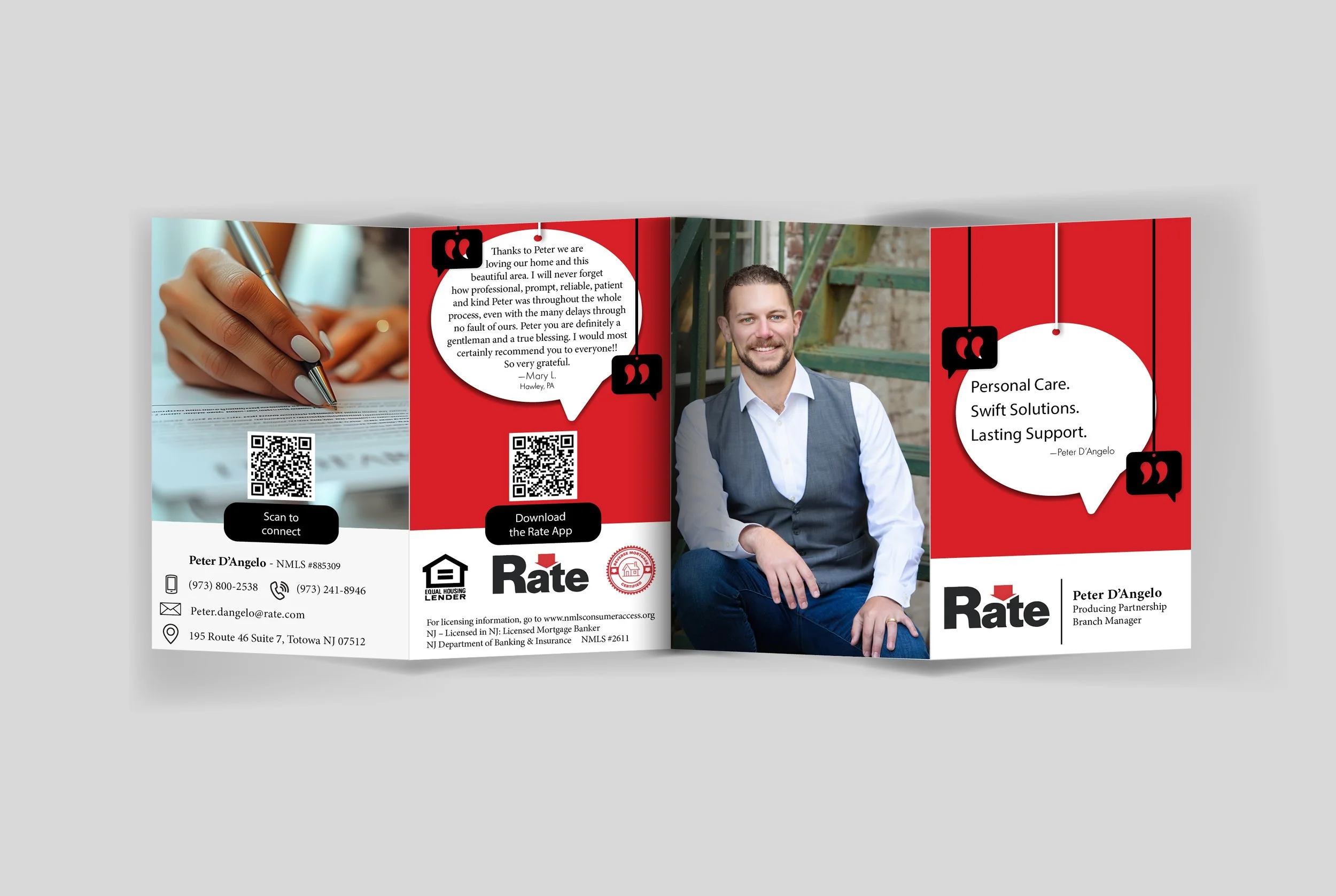
A Personal Introduction in a Pocket-Sized Format
The finished brochure does more than explain mortgage services, it introduces Peter D’Angelo and gives prospective borrowers a sense of the person they’ll be trusting with one of their biggest financial decisions.
Brand Force 5 developed a distinct visual identity for Pete’s marketing, creating the bold graphic language, typography and overall look and feel used throughout the brochure. Client testimonials reinforce trust and credibility, while QR codes and information about the Rate app connect the printed piece to digital tools and make it easy for prospective clients to take the next step. The result is a compact sales tool that brings Peter’s professional story, personal presence and multiple contact paths together in one memorable introduction.
See the brochure in action
Award-Winning Design
The brochure earned Second Place for Brochure Design at the NJ Ad Club Jersey Awards—losing First Place to another Brand Force 5 brochure, so we can’t be too upset about it.
More importantly, it has become an effective icebreaker for Pete, helping him start conversations, warm up leads, and make a memorable first impression with prospective clients.
See another brochure design Brand Force 5 created for Floor Coverings International.
Our Thanks:
We hope this case study provided insight into how Brand Force 5 approaches design challenges and transforms them into opportunities. If you’re ready to elevate your brand or discuss how we can support your next project, we’d love to connect. Reach out to our Chief Creative Officer, here and let’s create something extraordinary together!